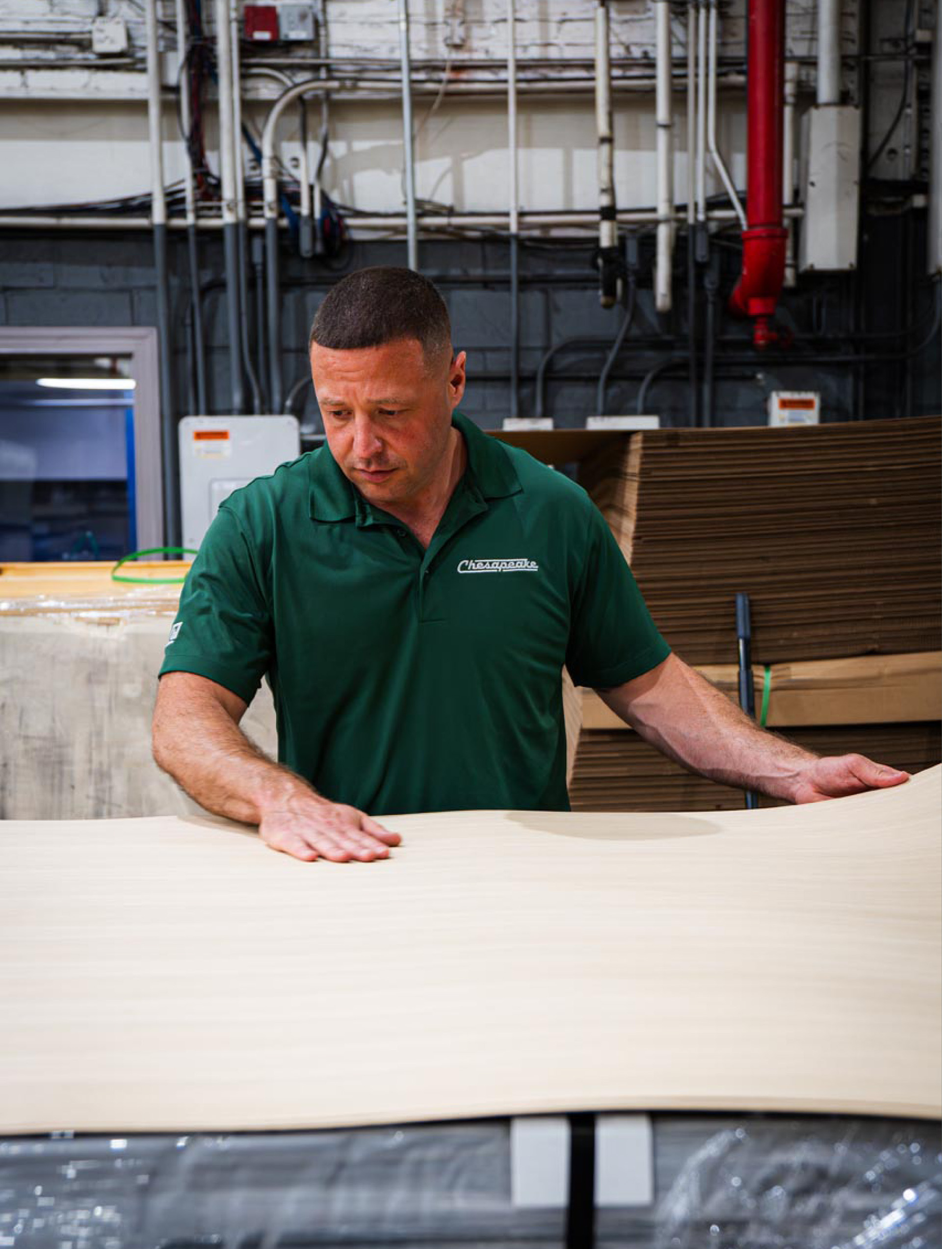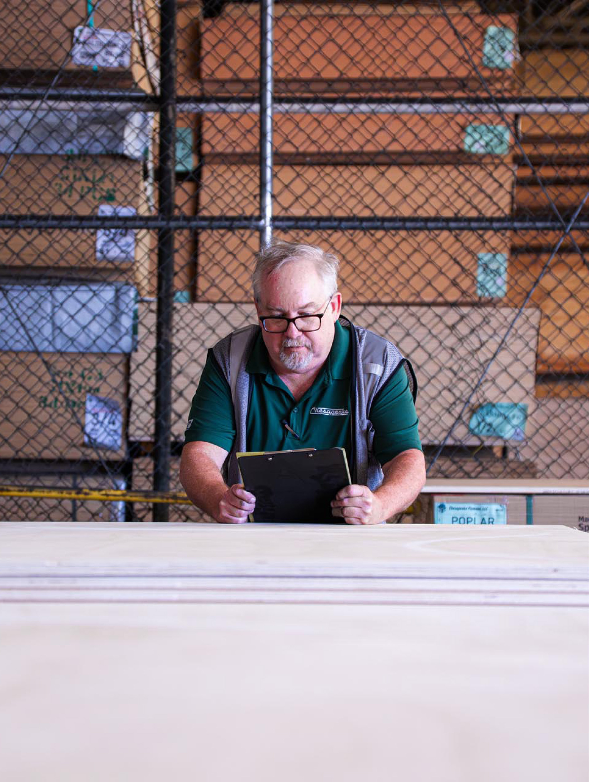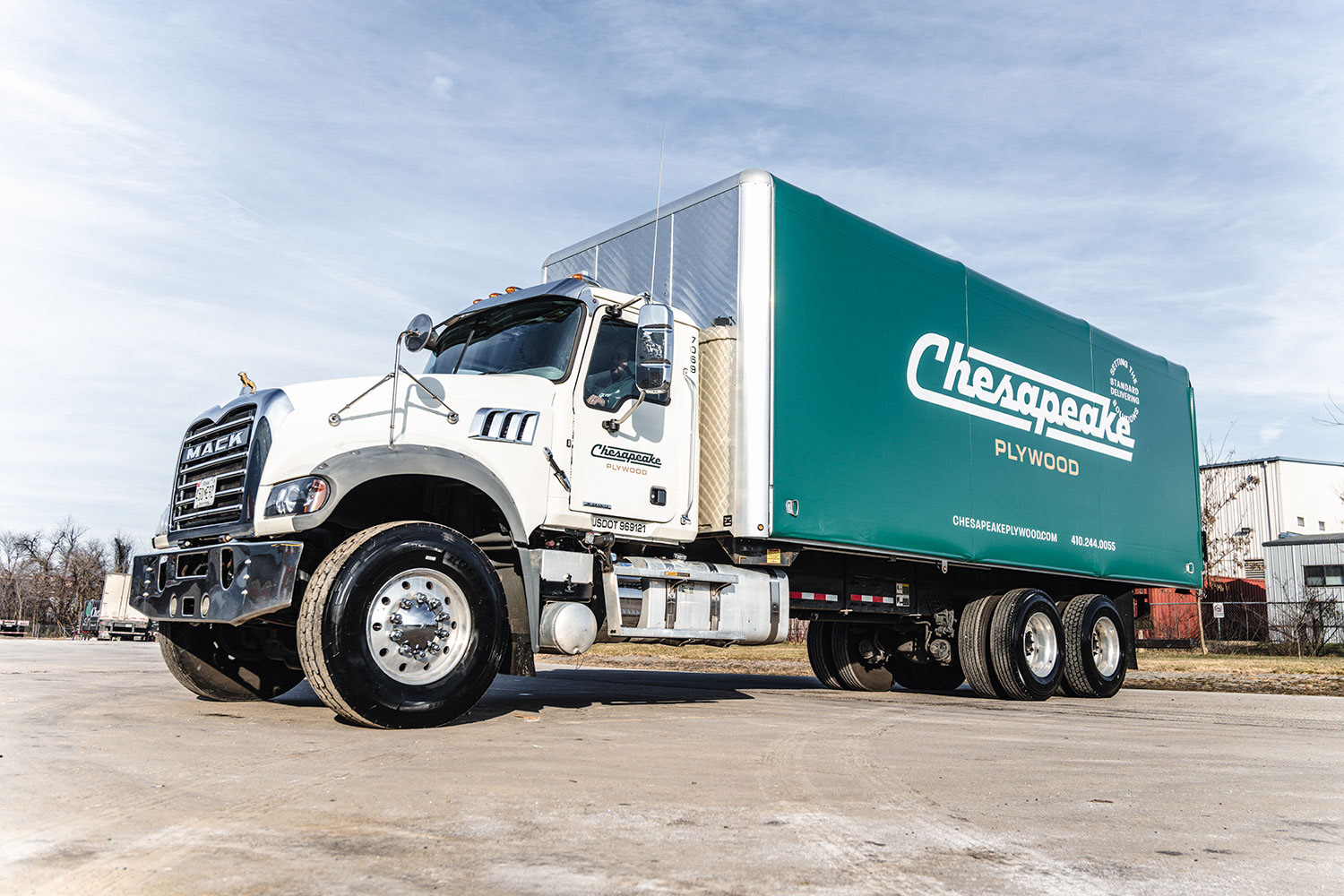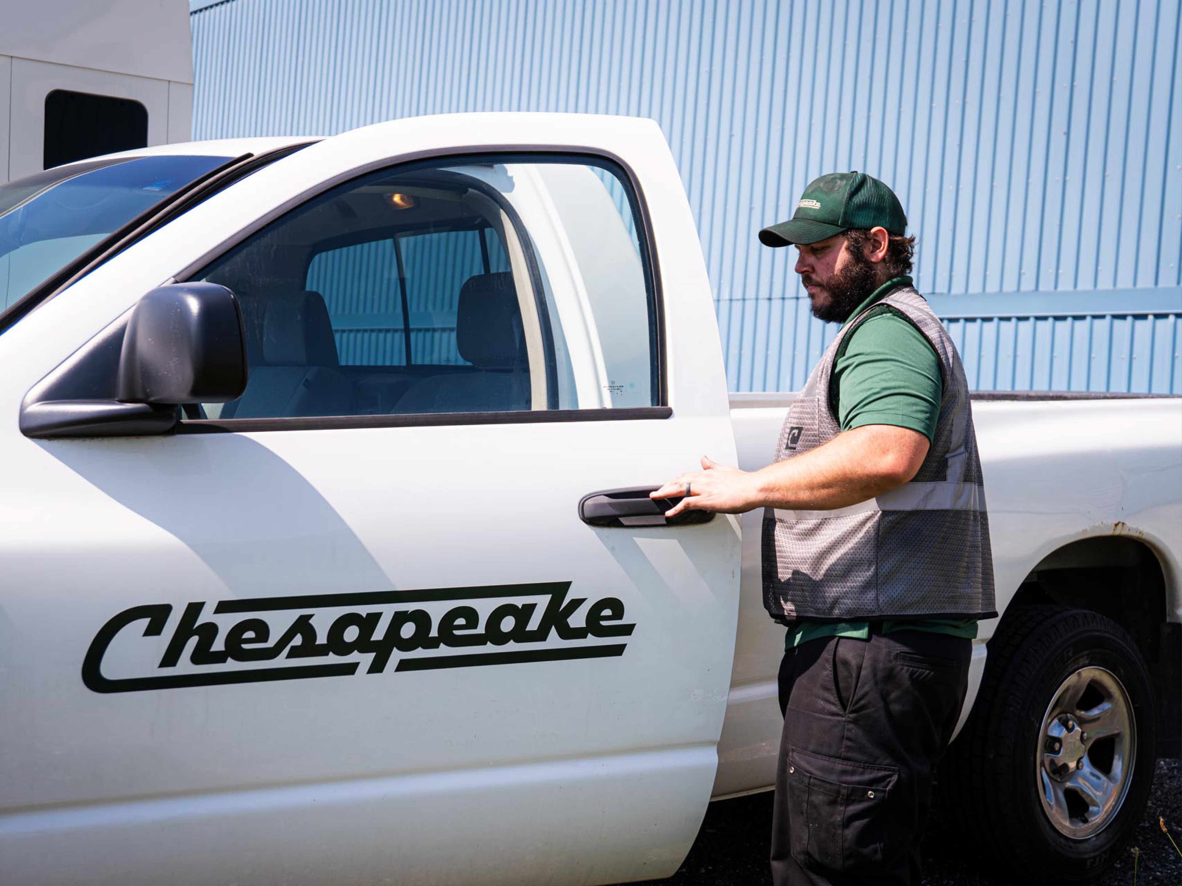


When Jeff Emden took over his family business, he saw an opportunity to elevate a trusted Baltimore-based plywood supplier into a premium, design-forward brand. The goal: move beyond the commodity mindset and stand out in a category defined by sameness. Strategically, the rebrand was about moving Chesapeake into a more premium space while maintaining the industrial authenticity that defines its roots. The new Chesapeake identity brings modern precision and craftsmanship to the forefront. A bold, forward-moving logo, refined yet industrial color palette, and typography inspired by the stenciled lettering commonly seen in plywood warehouses give the brand a confident, authentic voice. A new digital presence rounds out the system, redefining how the brand shows up, from the website and social channels to the fleet of trucks and soon-to-be-revamped office space. The result is a brand that feels as strong and intentional as the materials it supplies, a modern evolution of a family legacy built to lead the next era of Chesapeake Plywood.

