°Fluent
A name and identity that aims to take the power out of the flu.
2020
Role: Creative Director, lead desiger Jr. Designer: Andrew Greif Copywriter: Brian Beise Animations: Stephanie Koop
Agency: The Sasha Group
You may also like

HealthyLine
HealthyLine is an industry leader in heated mats and other wearable wellness-centric technology. Inspired by the calming ritual of stacking stones, their logo aims to set the tone with its softness and zen-like feel, while also abstractly forming the letter H. Much of the identity seeks to embody the strategy surrounding the idea of “making room to breathe”, and does so with a strict layout system that requires at least 50% of the space to be empty. Graphic elements we call “stones” are pushed to the side of the layouts, to represent the act of selective attention to what really matters: your health.
2023
Role: Creative Director Lead Designer: Joseph Hillenbrand
Agency: Sasha Group

Next Century Spirits
Next Century Spirits had breakthrough distilling technology but a forgettable brand. They tapped us to change that, so we reimagined everything from identity to digital experience. We built a bold new visual and verbal system inspired by their science-meets-craft ethos, anchored by a modular logo that fuses speed, precision, and flavor. Then we transformed their website into an immersive tasting room and revenue engine, using motion, interactive demos, and a flavor-forward palette to turn Spiranova™ innovation into a visceral brand experience. The result? A foundation built not just to look different — but to sell with the same confidence they pour into every bottle.
2025
Role: Creative Director / Brand Designer: Charlie Coombs / UI/UX: Eric Beckman, Karli Vare
Agency: Digital Surgeons
Chris' Coffee
A family-owned and operated coffee business that was born out the back of a 1975 El Camino.
2021
Role: Lead Designer

IRIS Lunar Rover
Brand identity for the smallest and lightest rover ever to go to space. Carnegie Mellon University’s Iris will be the first American robot to drive on the Moon.
2019
Role: Lead Designer Animations: Stephanie Koop
Agency: Oxcart Assembly
Nitecrawler
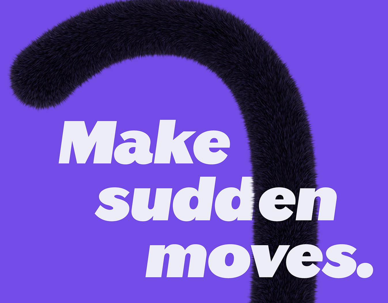
The Travelpass Group brought us a hyper-transactional beta platform – Nitecrawler – in need of a compelling brand foundation and distinctive brand identity. With the last-minute hotel category feeling like a jungle, we leaned into the brand’s creature-esque name by creating a distinct, intriguing identity with a mysterious and curious mascot, the Nitecrawler, who’s always on the hunt for the next great deal.
2023
Role: Creative Director/Lead Designer Sr. Designer: Andrew Grief
Agency: The Sasha Group
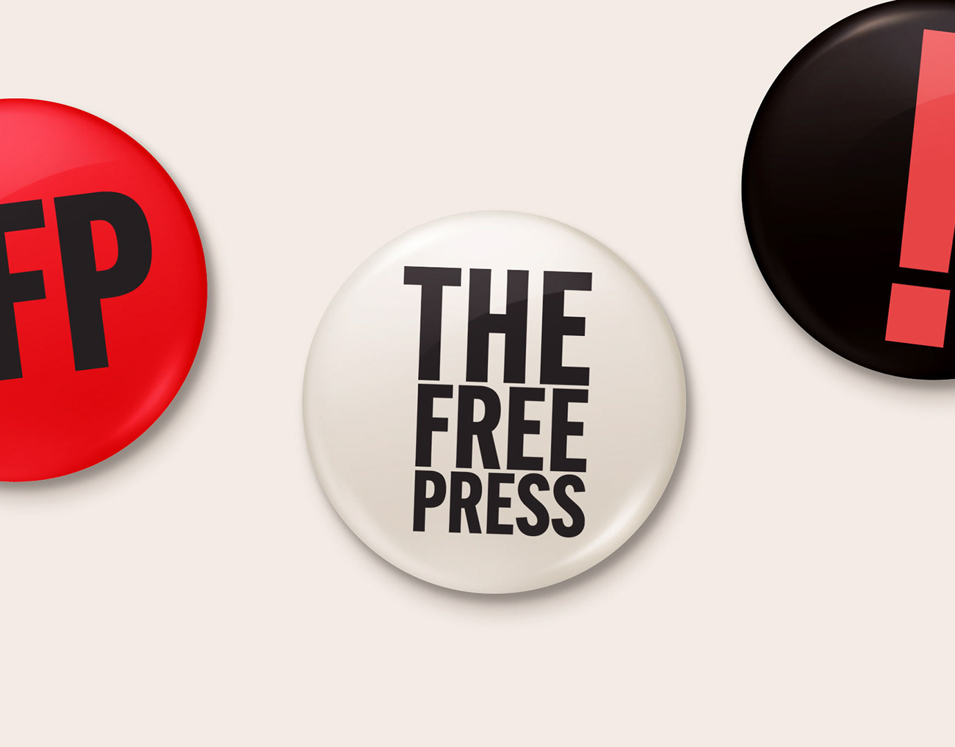
The Free Press
Brand identity for a newly-formed media company founded by Bari Weiss.
2023
Role: Lead Designer
Agency: BigEyed Wish
Jimbo's Detailing
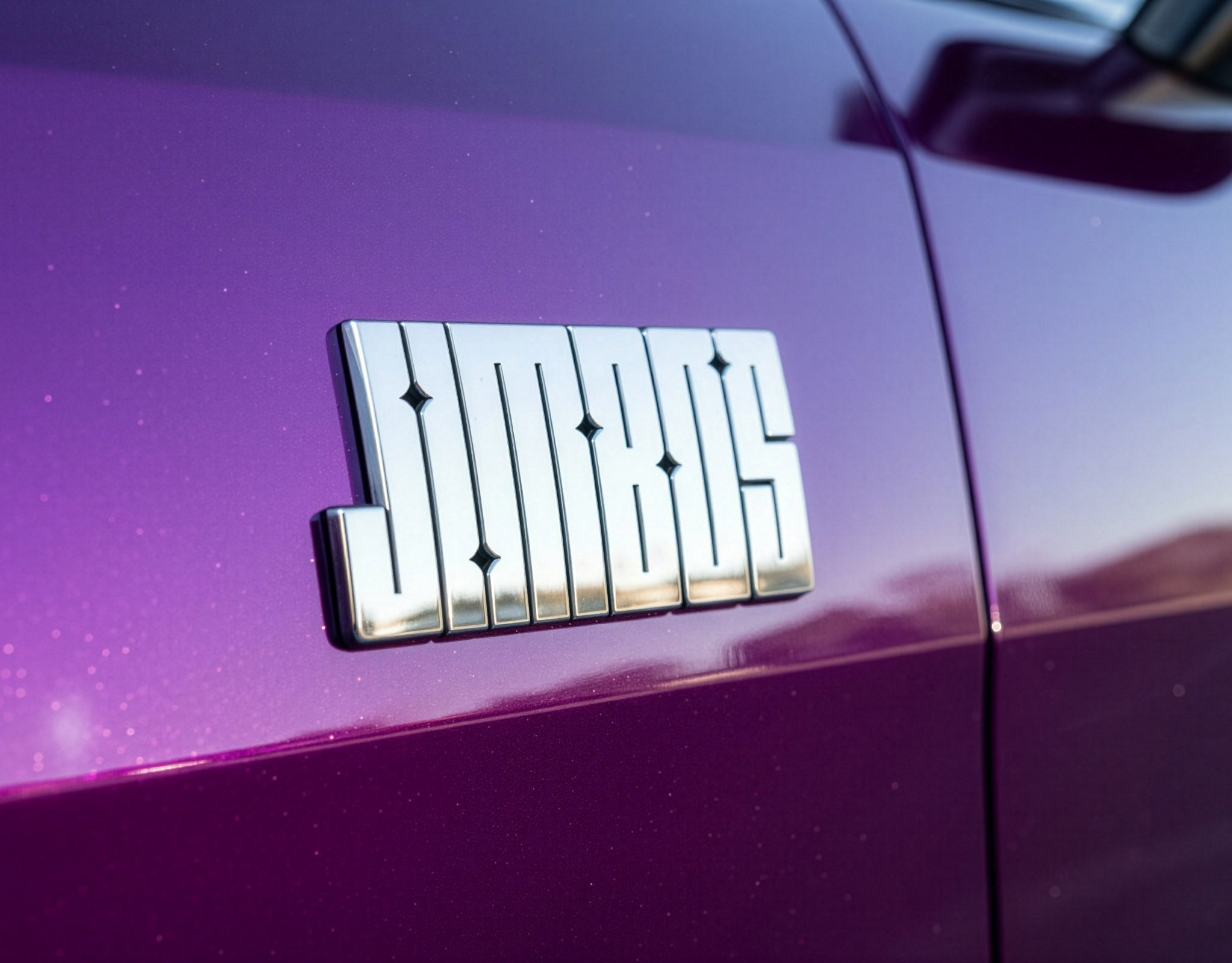
Jimbo’s Detailing was born from the personality and expertise of YouTube creator Jimbo Balaam, but it needed more than a name to stand out in a crowded category where every brand looks the same. We set out to break the mold of car care — a space dominated by dark packaging, macho branding, and loud product claims — by building an identity that was as fun and approachable as Jimbo himself. Through strategy, design, and naming, we created a brand that sparkles with personality: a custom logo, bold color palettes, playful illustrated characters, and cleverly named products like The Super Soaper, Tough As Shell, and Gloss Boss. The result is a brand that balances high-performance credibility with lighthearted expression — one that connects instantly with Jimbo’s loyal audience while attracting new fans. Since launch, Jimbo’s has seen steady double-digit growth month after month, proving that car care doesn’t have to be so serious to be seriously successful.
2025
Role: Creative Director / Lead Designer
Scope: Strategy & Positioning, Brand Identity, Product Naming, Packaging / Illustrations: Andrew Greif
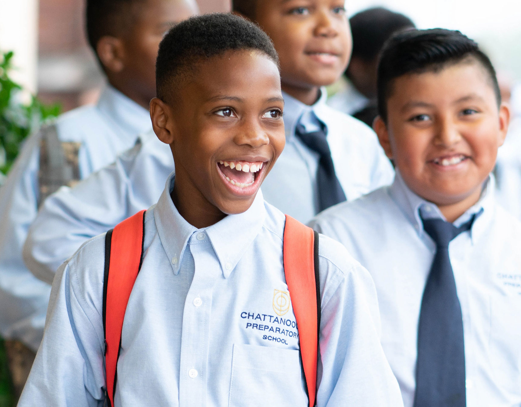
Chattanooga Preparatory School
Brand identity for an all-boys public charter school located in Chattanooga, TN that is building the men of tomorrow.
2018
Role: Lead Designer
Fleishers Farms and Butchery
Brand refresh for your favorite local butchery.
2019
Role: Lead Designer
Agency: The Humans
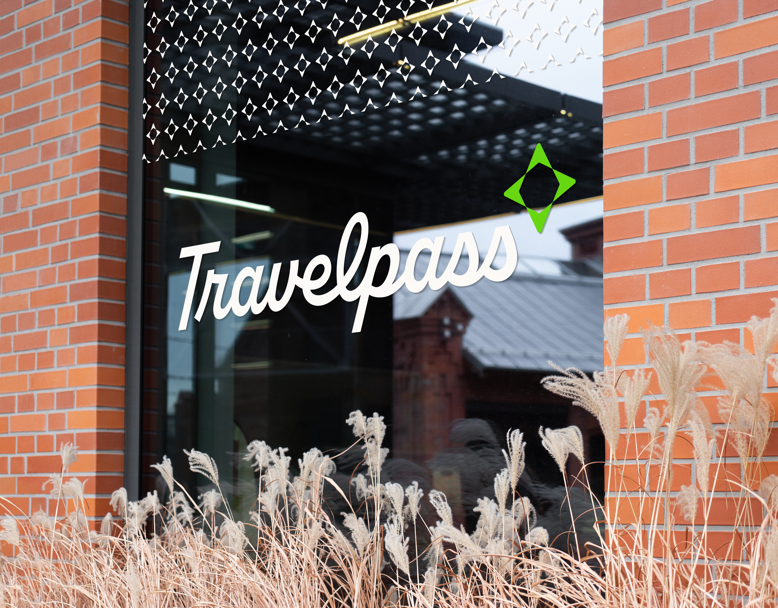
Travelpass
Travelpass came to us as they were making the shift from B2B to DTC, with a customer experience-centric platform for travel booking and itineraries. They needed clear brand foundations and an identity that could make a splash in an industry dominated by household names like Airbnb, Expedia, and Priceline. With the brand’s mission of opening new doors and enriching people’s lives through travel, we created an identity that’s meant to evoke the sense of wonder you feel when traveling around the world and all of the personal journaling and storytelling elements that come with travel.
2023
Role: Creative Director Lead Designer/Illustrator: Andrew Greif Designer: Joseph Hillenbrand Copywriter: Brian Beise
Agency: Sasha Group
